
Tuesday, 28 May 2013
Submission Boards Brief 7 Max Physick
For a brief I only spend 2 days of I was really happy with the end result. It feels like a brand that can be expanded on way further then just business cards and a letter head. It feels like it has hit the high end commercial tone for max's needs and I wouldn't be embarrassed handing these out. The colour scheme catches my attention and the type is clear and informative. Good quick freelance brief.
Submission boards Brief 6 Alex Dodgson
This brief has been a good project to undertake in my 3rd year. I was dealing with a client who had an incredible eye for detail and always getting on my back and keeping him happy has showed me that I can deal with clients and produce good work under pressure. I feel that the logo is potentailly the only thing I am not fully happy with and If I had more time I would like to design alex a minimal brand to then expand into an exhibition instead of the other way around. I have also learnt some valuable skills dealing with commercial printers and know roughly how much things cost and how long it takes. Overall I was happy with this brief but felt it could of potentially looked a bit better if I didn't relay on having to call back to the client as much as I had to.
Submission boards Brief 5 UK greetings
Initially I was really happy with the result of this brief but now looking back at the end of 3rd year I feel that I could of done much better. I loved experimenting with augmented reality but i feel this brief was not the right one for me or my portfolio. I am not a commercial greeting card designer but I am good at working with augmented software in collaboration with Dan. I also learnt value bill skills needed to produce a functioning app and ipad app.
Submission Boards Brief 4 Cheap Thrills
I am really happy with the result of this brief. I just feel annoyed that I ran out of time at the end to fully exploit this brief with an additional range of 4 more vinyl. I will continue this and complete it for my final year exhibition. I also feel that although this brief is aesthetically nice it might not be too practical for a small (probably low budget) record label as it would be very expensive to recreate this branding on a commercial scale but the concept is still sound and Im sure it would be possible to rework it in a cheaper format.
Submission boards Brief 3 Jake Coleman
This brief was a good one. Although after looking over it I feel that I reworked it far too much, spend way too much time on it when really I could of gotten it done in half the time it took and moved onto my other briefs. It made me learn that working with clients and producing work that you know will be used puts additional pressure on you to make sure its perfect. I loved working with a furniture student, I learned a lot and made a good friend out of this brief. I only wish i spend less time redesigning it and expanded the range into promotional material as well which would of not taken much time at all.
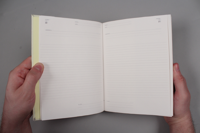
Submission Boards Brief 2 Graphic Notebooks
My only regret on this brief is not spending more time working on it as hard as we did during the last 2 weeks. the production side of graphic notebooks took far longer then we initially expected it to and kind of came round and stopped this brief from being just good to great. On the bright side working with Marty Edwards has been an absolute delight, we are friends but I can confidently say we can work together without an issue. When push came to shove during deadlines, we worked hard, worked late and got it done with no issue's. It was also good to get a collaboration where I didnt end up having to do everything. most painless collaboration sheet i've ever filled in. From a design point of view im annoyed that our embossing plate didnt work and we should of ordered one of those hand embossers that would of made this brief much better.
Submission Boards Brief 1 Fashion Yearbook
Now there were a lot of ups and downs on this brief. But over all my only regret is having to work with the fashion tutors. I feel that we could of produced a beautiful printed publication that their degree program would of been more then happy with seeing as me managed to pull this mock up out the back in a matter of a weekend. I enjoyed collaborating with my group but again all the pressure made this a horrible brief and put a downer on my final major project for about a month, at least I know how to spot trouble clients early on and after seeing our mock ups it has not knocked my confidence as a designer.
Range

The final range for hand in is Letter heads x1, Vinyl cover x1, business cards and envelope.
I am happy at the end result as the range fits really well together just really annoyed that I didn't get time to print the rest of the covers. One issue that is obvious is that it would be really expensive for the company to reproduce this brand with their letterheads due to having to print with white ink so I made a additional letter head printed on Grey to make an affordable back up.

What I didnt get time for.
Seeing as I had 2 failed days worth of screen printing. I ended up having 4 vinyl covers I never had time to print.

This is the vinyl cover packaging for all the vinyls to go in. It has all the artists and track names on the fron and its designed slightly bigger then the rest so 5 vinyls can slide into it.

Vinyl 1

Vinyl 2

Vinyl 3

Vinyl 4
All the vinyls work in a series and have samples of the wave form sampled so each cover has part of the actual track screen printed on its cover.
Monday, 27 May 2013

Sunday, 26 May 2013
Range
Grid Book 1:


Ideal for any structured drawing of any nature.
Grid Book 2:


Ideal for any 3-dimensional drawing of any kind.
Grid Book 3:


Ideal for setting lines of text and drawing typography.
Studio Notebook:


Ideal for organising your busy designer lifestyle.
Website 3.
Example pages of our suggested website. I would like this to of been made but I just dont have the time and skills to be able to code this yet. I will in the near future but not for FMP.


Website.2
The shop page. Marty gave me a quick hand and set the images and the text for me to then take into photoshop as I knew my way around it a little bit better then him and would be more efficient.


We wanted to duotone the images and then only have 1 come up in colour when you hover over it as a rollover image. So I had to duotone everything in photoshop then move the layers back into my master file.


Example of 1 image's rollover being activated.

Website (point of sale)
I wanted the welcome screen for the website to run a little bit differently then your conventional website. So i decided to keep the really clean image of Graphic notebooks and produce a Giff which will run in a continues look showing off the products and the range on the home screen untill you click enter which should take you to the shop page.

format i designed to.

Layers I animated

Animation frame times.

Final product but obviously its only 1 still image.
logo Giff.

Was playing around with animation options in photoshop and just quickly created a animated Giff logo for the graphic notebooks. before making a proper home page for the the website utlising the same tecknique.
Photography.
G:N by chvanniekerk

So I've gotten really good at setting up photography studio's by 3rd year it has to be said. Probably half of 3rd year graphic design photographed in the space I set up and i hope its added to all they're work because it has to mine.


embossing fail


As you can see the streaking from the embossing plate has left some nasty marks on the paper. but just a bit of cosmetic damage. The plate has left such a light mark overall the quality of the deboss is so bad it doesnt really matter... will have to photoshop lines out for photoshoot.
Embossing plate
Embossing plate. The bellow indesign screenshot is basically a lot of black. with the tiny bit logo sat there. all the black will be cut away.


As you can see this embossing plate really did not work very well. because so much had been cut away and it was such a little area which wasnt affected it pretty much ate away at the font. If i had to do this again embossing would cute away just the typeface and leave the rest of the plate untouched. much less time in the acid bed and probably a better result. This plate would of been a bit better if the bottom of the e hadn't broken off... oh well.
Grid book binding
Stich bind for the Grid notebooks. The Grid notebooks were only 32 pages so a sitch bind was ideal, this was also easily done in studio.


Belly bands added onto covers.
Subscribe to:
Comments (Atom)